
Tuesday, August 9, 2011
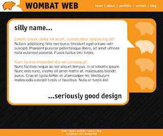
Finally, a mock-up.
I've had the past few days pretty easy at work, and decided to take a couple of hours and work on a mock-up for the WombatWeb site. Here is a sample page; let me know what you think.

Friday, July 22, 2011
Hey, I made this yak...

...just for you.
Water-based media is fun sometimes. I don't do much of it, but current studio limitations what they are, it's either that or no painting at all. I think it's good for me, what with the learnin' and all. Sure beats video games.
Here's a detail for your optical nuggets:

Tuesday, July 5, 2011
Wombat Web, round 3
It's time to play another exciting installment Design Matt's Website For Him!
I had a bit of a love affair with the Minuscule font family, but it's over now. I've decided to toss up a few other font flavors, and I need you to help me make up my mind. Minuscule is still very much in the mix, but it is now contested by 9 other champion fonts (none of them are quite as crazy, but they all are good). Let me know which you like best, or if you know of a typeface that would look wicked sweet that I have overlooked, throw it out there; I may have it. If I don't have it, and it's affordable, I may even pick it up! Thanks friends!
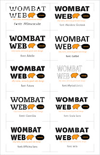
I had a bit of a love affair with the Minuscule font family, but it's over now. I've decided to toss up a few other font flavors, and I need you to help me make up my mind. Minuscule is still very much in the mix, but it is now contested by 9 other champion fonts (none of them are quite as crazy, but they all are good). Let me know which you like best, or if you know of a typeface that would look wicked sweet that I have overlooked, throw it out there; I may have it. If I don't have it, and it's affordable, I may even pick it up! Thanks friends!

Hooray for crowd-sourced design!
Tuesday, June 28, 2011

Internets! I need your help!
I've been working on this super-secret web design project, and I'm really enjoying myself. A lot. So I thought, you know, maybe I could do more of it. So I'm making this thing. I hesitate to call it a company yet, but that is the general idea.
Anyway... I need a logo, and after a bunch of sketches, I came up with this. This thing I like. The question is, do you like it? What bits are good, what bits not-so-much? Or is the whole thing rubbish? Tell me true, Martha... I can take it.
After we get this sorted out, I will get crackin' on the old homepage-o, and I will post my progress for further critique.
Without further ado, here is the vectorige (I initially spelled this "vectorage," but it seemed very angry; I though you should know):

p.s. I just realized the kerning on "web" in the upper left is total crap. Forgive me for being too lazy to fix it right now; I'm hungry.
Anyway... I need a logo, and after a bunch of sketches, I came up with this. This thing I like. The question is, do you like it? What bits are good, what bits not-so-much? Or is the whole thing rubbish? Tell me true, Martha... I can take it.
After we get this sorted out, I will get crackin' on the old homepage-o, and I will post my progress for further critique.
Without further ado, here is the vectorige (I initially spelled this "vectorage," but it seemed very angry; I though you should know):

p.s. I just realized the kerning on "web" in the upper left is total crap. Forgive me for being too lazy to fix it right now; I'm hungry.
Subscribe to:
Posts (Atom)