(click for a big version)
Wednesday, December 14, 2011
Saturday, August 27, 2011

Thursday, August 11, 2011
A level 8 techinque.
I saw this sweet video of Rick O'Brian (whom I deeply respect) sketching with a quill pen, but holding in underhand, like you might a pencil, and I though to myself, "that looks wicked fun." It is. I will definitely be doing more of this. Here are a couple of the quickies I did this evening at a café near my place.

This one is a girl who kept staring at me. Obviously she picked up my pheromones, and couldn't help but notice what a wicked sex machine she was beholding.

And this one is my favorite apocalyptic equestrian enthusiast.
Edit: Here in the Rick O'Brien video. Obviously way better than what I am doing, but I will beat him one day!
Tuesday, August 9, 2011
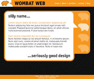
Finally, a mock-up.
I've had the past few days pretty easy at work, and decided to take a couple of hours and work on a mock-up for the WombatWeb site. Here is a sample page; let me know what you think.

Friday, July 22, 2011
Hey, I made this yak...

...just for you.
Water-based media is fun sometimes. I don't do much of it, but current studio limitations what they are, it's either that or no painting at all. I think it's good for me, what with the learnin' and all. Sure beats video games.
Here's a detail for your optical nuggets:

Tuesday, July 5, 2011
Wombat Web, round 3
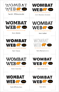
It's time to play another exciting installment Design Matt's Website For Him!
I had a bit of a love affair with the Minuscule font family, but it's over now. I've decided to toss up a few other font flavors, and I need you to help me make up my mind. Minuscule is still very much in the mix, but it is now contested by 9 other champion fonts (none of them are quite as crazy, but they all are good). Let me know which you like best, or if you know of a typeface that would look wicked sweet that I have overlooked, throw it out there; I may have it. If I don't have it, and it's affordable, I may even pick it up! Thanks friends!
I had a bit of a love affair with the Minuscule font family, but it's over now. I've decided to toss up a few other font flavors, and I need you to help me make up my mind. Minuscule is still very much in the mix, but it is now contested by 9 other champion fonts (none of them are quite as crazy, but they all are good). Let me know which you like best, or if you know of a typeface that would look wicked sweet that I have overlooked, throw it out there; I may have it. If I don't have it, and it's affordable, I may even pick it up! Thanks friends!

Hooray for crowd-sourced design!
Tuesday, June 28, 2011

Internets! I need your help!
I've been working on this super-secret web design project, and I'm really enjoying myself. A lot. So I thought, you know, maybe I could do more of it. So I'm making this thing. I hesitate to call it a company yet, but that is the general idea.
Anyway... I need a logo, and after a bunch of sketches, I came up with this. This thing I like. The question is, do you like it? What bits are good, what bits not-so-much? Or is the whole thing rubbish? Tell me true, Martha... I can take it.
After we get this sorted out, I will get crackin' on the old homepage-o, and I will post my progress for further critique.
Without further ado, here is the vectorige (I initially spelled this "vectorage," but it seemed very angry; I though you should know):

p.s. I just realized the kerning on "web" in the upper left is total crap. Forgive me for being too lazy to fix it right now; I'm hungry.
Saturday, June 18, 2011
Fantasy Landscapes - Now with 100% More Gouache!


Friday, May 27, 2011
Look ma, no eyes!
Too tired paint. Still want draw. Nap draw. Shut eyes. Dream. Move Hand. Make thingies.
I haven't done any blind drawing in a long time. I'm much better at it then I was the last time I tried, but most of these are still real awful.

totally click it to make it bigger
My favs:


These are probably the best skull and T-Rex drawings I've ever made.
Saturday, May 14, 2011
PAINT!
warning: this one has the swears.
Sometimes I do things so tremendously stupid that I stare back at them slack-jawed as a thin trail of foamy spittle makes a trail down my chin. For instance, not painting for months. Months. The last time I slung mud was the end of this past December. I've been living in an apartment best described as small. This has limited my opportunity to paint to, um, no opportunities. Unless, of course, I didn't mind a bit of asphyxiation (not even the erotic kind). I finally had enough though, and said, "Well, fuck you brain cells, I don't need you," tossed open my tiny window, and busted out the pallet.
Goddamn, it feels so good. Orgasmic. I forgot how much I love this thing I do. I went for about five hours without stopping. It was sweet.
(feel free to take that last paragraph out of context)
Anyway, here are the goods. One is the first couple of passes at a copy of the portrait of Cornelius Van der Geest by Anthony Van Dyck. The other one is the first coat of a picture of a awesome old photo I found online. Nothing says 'Merica like a nine-year-old girl with Old Glory and a Glock. Don't worry, her legs aren't as freakishly stunted as they look in the photo.


Here's the setup:

Thursday, April 14, 2011

Wednesday, April 13, 2011
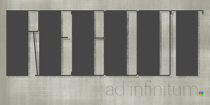
reboot infinately.
My computer has taken to crashing a good 10-or-so times a day. It especially enjoys doing this while performing such grueling tasks as, opening an email, or saving a text document. It does not do so when I have both Photoshop and Illustrator running. I don't understand, but I have made for it this visual ode:

click for adorable animated version
New computer is on the way, but man, my hard-reboot finger is getting tired.
New computer is on the way, but man, my hard-reboot finger is getting tired.
Tuesday, March 22, 2011
The myth of the artistic gift
Don’t tell me I’m gifted. It’s insulting. My ability to make pictures is not a gift. I suppose you could say that I have been gifted the faculties necessary to make art, sure; my hands, my eyeballs, they could be considered gifts. I did nothing to earn them, so I suppose that counts. Thanks mom and dad, and countless years of mutation and selection. But the thing is, pretty much everyone has access to those biological tools. If you are reading this, good chance is, you’ve got them too. Having strong artistic abilities, however, is no gift.
A gift is something given to a person. Artistic skill is never given to someone, and I am no exception. I busted my ass to get to where I am, and I’m not even good. I have been drawing for as long as I can remember, and when I am not making art, I am thinking about making art (or sometimes the sex – what’s a guy to do?). It’s not some talent I have; it’s a skill cultivated through years of hard work and countless failures. I was not born with this. It was not handed to me in some gilded chalice. I was not blessed with it. It was not free. Don’t call it a gift.
If you look at a truly amazing piece of art, know this: Whoever made that thing, poured everything they had into it. They may have made it look easy, but I assure you it wasn’t. It took all of the effort they have mustered over their entire lives to make that piece. Art is hard. Don’t ever be fooled into believing otherwise. If you are an artist, don’t let anyone make what you do out to be less than it really is. And if you don’t think making art is hard, then you are probably a shitty artist. If you are not exhausted after every painting you do, you’re doing it wrong. Everything you make should be the best you can make it, and that means working harder than you’ve ever worked before. Every time.
I know I am not very good at what I do. Not yet. But I intend to be the best. Maybe I cannot be the best artist in the world (art is subjective after all…) but I can certainly be the best artist I can be. The only way to become the best, however, is to throw the yolk over your shoulders and plow. The cliché goes, “suffer for your art,” and it is a damn good cliché. This doesn’t mean starve yourself, or that you have to be emotionally distressed, or be constantly filled with angst. No, it means something far simpler. Bust. Your. Ass.
That all said, it’s time for me to shut up and draw.
end rant
Sunday, March 20, 2011
Flying Machine
Here is a little drawing I did for sketch contest. The theme was 'flying machine.' It's not much, but it's something. Pencil and gouache on some grey paper.

He's got some pretty tiny hands.

He's got some pretty tiny hands.
Sunday, March 13, 2011
Guess Who's a Bad Blogger, and Has Two Thumbs...
This guy. I know, I know. I never post anymore. We've grown distant, you and I. I'm sorry. Please don't leave me; I don't want to hurt the kids.
Groveling aside, I do have my excuses, namely that me new apartment is far too small to oil paint in. They make them mighty small in Seoul. I know it's not much of an excuse, since I could always draw, or do some sort of less toxic painting, but I am also just bad at posting the things I do make. I thought it was time I gave the sharks something else to nibble, so here you go. And don't be offended at being called a shark; they are noble, majestic creatures, and they get a whole week on the discovery channel to themselves. You should be honored.
Anyway, here is a logo I whipped up for my father for his birthday. He is a meat-smoking maniac. Which, it turns out, is nothing like a PokeManiac. Fact.
Here you go:

B&W and 3-Color.

Super limited edition woodburn.
Thursday, January 27, 2011

Wombats!

Here is a BibliOdyssey collection of wombat-y illustrations by Noela Young from the book 'The Adventures of the Muddle-headed Wombat' by Ruth Park. BibliOdyssey is a wonderful blog that collects vintage (and older) book illustrations, and has provided a good deal of inspiration for me. Check it out.
'The Adventures of the Muddle-headed Wombat' | BibliOdyssey
Monday, January 17, 2011
Site
Hey everybody, sorry for the lack of posts this week; I've been really busy working on my new website, but good news! It's done. I really enjoyed myself, and I think I want to get good at this whole web design thing. Check it out, and let me know what you think.
Sunday, January 9, 2011
French Ultramarine
A friend of mine was enchanted with the color French Ultramarine, but not the actual color. He likes the name. He asked me to draw a French Ultramarine. I asked him if it should be a Napoleonic marine, or some sort of cyborg super-soldier. I decided a compromise would be best. I haven't done any sort of character creation in a while, and I almost never draw robots or cyborgs, so forgive the crappiness of it. Here he is, the French Ultramarine:

Yeah, he flies.

Yeah, he flies.
Friday, January 7, 2011
Sheep Mountain - Colors
I picked up a copy of Jim Gurney's new book a while back, and it has proven to be one of my better book purchases. Had Color and Light been my college Color Theory textbook, I am certain I would be many times more confident with color than I am today. Well, it didn't exist back then, but now that I have read it, I decided I need to give it's lessons a go.
I thought that the sheep mountain piece would be a perfect opportunity to try out some of Jim's sound advise on how to handle both light and color. I started with a small color study, and decided to implement two of the color restrictions Mr. Gurney outlines in his book. The first is a simple color gamut based on the Yurmby wheel. For those of you unfamiliar with the Yurmby wheel (as I was until I read the book), it is a color wheel that employs six primaries of both the print and light spectrums: RGB and CMY. The wheel goes like this: Yellow, Red, Magenta, Blue, Cyan, Green. It provides a much fuller range of colors than is allowed with the standard Red-Yellow-Blue color wheel. Anyway, my color gamut looks like this:
 (the image was made using photos of the wheels in Jim's book)
The idea behind the gamut is to limit the number of colors you allow yourself, in order to create a strong unity in the piece, and as a safeguard against overwhelming the viewer with too many colors. It also is a quick way to develop a strong mood in the piece. My gamut for this painting is fairly neutral, with the strongest chroma falling somewhere between pure blue and pure cyan.
The other method I am employing to limit myself is to use a very limited pallet. The only tubes of paint I am using are Vermilion, French Ultramarine, Cadmium Yellow light, and Titanium White. This is a huge hurdle for me to jump. I am really used to using about 10-15 different tubes of paint on any given painting, and cutting back to only three colors, plus white was a huge challenge. The color study for the painting turned out pretty ok though, and I am excited to get cracking on the actual piece. Here's the study (sorry about all the white spots, photographing canvas with overhead fluorescents is a bitch):

Oh, and I didn't forget about the self-portrait, I just am not at a point with it that I am ready to post anything. Maybe after the weekend.
I thought that the sheep mountain piece would be a perfect opportunity to try out some of Jim's sound advise on how to handle both light and color. I started with a small color study, and decided to implement two of the color restrictions Mr. Gurney outlines in his book. The first is a simple color gamut based on the Yurmby wheel. For those of you unfamiliar with the Yurmby wheel (as I was until I read the book), it is a color wheel that employs six primaries of both the print and light spectrums: RGB and CMY. The wheel goes like this: Yellow, Red, Magenta, Blue, Cyan, Green. It provides a much fuller range of colors than is allowed with the standard Red-Yellow-Blue color wheel. Anyway, my color gamut looks like this:

The idea behind the gamut is to limit the number of colors you allow yourself, in order to create a strong unity in the piece, and as a safeguard against overwhelming the viewer with too many colors. It also is a quick way to develop a strong mood in the piece. My gamut for this painting is fairly neutral, with the strongest chroma falling somewhere between pure blue and pure cyan.
The other method I am employing to limit myself is to use a very limited pallet. The only tubes of paint I am using are Vermilion, French Ultramarine, Cadmium Yellow light, and Titanium White. This is a huge hurdle for me to jump. I am really used to using about 10-15 different tubes of paint on any given painting, and cutting back to only three colors, plus white was a huge challenge. The color study for the painting turned out pretty ok though, and I am excited to get cracking on the actual piece. Here's the study (sorry about all the white spots, photographing canvas with overhead fluorescents is a bitch):

Oh, and I didn't forget about the self-portrait, I just am not at a point with it that I am ready to post anything. Maybe after the weekend.
Tuesday, January 4, 2011
A (bad?) habit.
I have a habit. I tend to start a lot of paintings, and finish very few. Here is another beginning...
I was looking into some places here in Korea that I could visit, and I came across the island of Ulleungdo, which looks just beautiful. A bit like New Zealand, and I cannot think of a prettier place on the planet than New Zealand. Anyway, I found this picture:

I thought, "Man that's a cool mountain. You know what would make it cooler? If it were more shaped like a wang, and had goats in the foreground." So I made this sketch:

I liked it, but decided I have painted a lot of dicks in my day, and maybe I should tone down the phallic nature of the peak a bit. I came up with this drawing, on MDF:
It is only a start, and I will let you know when I finish the drawing/start on the painting. Here is a close-up of dem sheepies and their shepherd friend:

I was looking into some places here in Korea that I could visit, and I came across the island of Ulleungdo, which looks just beautiful. A bit like New Zealand, and I cannot think of a prettier place on the planet than New Zealand. Anyway, I found this picture:

I thought, "Man that's a cool mountain. You know what would make it cooler? If it were more shaped like a wang, and had goats in the foreground." So I made this sketch:

I liked it, but decided I have painted a lot of dicks in my day, and maybe I should tone down the phallic nature of the peak a bit. I came up with this drawing, on MDF:

It is only a start, and I will let you know when I finish the drawing/start on the painting. Here is a close-up of dem sheepies and their shepherd friend:

Subscribe to:
Posts (Atom)