Here's a little fella for your eyeballs.
straight cavein'
Thursday, January 27, 2011
Wombats!
Here is a BibliOdyssey collection of wombat-y illustrations by Noela Young from the book 'The Adventures of the Muddle-headed Wombat' by Ruth Park. BibliOdyssey is a wonderful blog that collects vintage (and older) book illustrations, and has provided a good deal of inspiration for me. Check it out.
'The Adventures of the Muddle-headed Wombat' | BibliOdyssey
Labels:
everything else
Monday, January 17, 2011
Site
Hey everybody, sorry for the lack of posts this week; I've been really busy working on my new website, but good news! It's done. I really enjoyed myself, and I think I want to get good at this whole web design thing. Check it out, and let me know what you think.
Labels:
everything else
Sunday, January 9, 2011
French Ultramarine
A friend of mine was enchanted with the color French Ultramarine, but not the actual color. He likes the name. He asked me to draw a French Ultramarine. I asked him if it should be a Napoleonic marine, or some sort of cyborg super-soldier. I decided a compromise would be best. I haven't done any sort of character creation in a while, and I almost never draw robots or cyborgs, so forgive the crappiness of it. Here he is, the French Ultramarine:
Yeah, he flies.
Yeah, he flies.
Labels:
Drawings
Friday, January 7, 2011
Sheep Mountain - Colors
I picked up a copy of Jim Gurney's new book a while back, and it has proven to be one of my better book purchases. Had Color and Light been my college Color Theory textbook, I am certain I would be many times more confident with color than I am today. Well, it didn't exist back then, but now that I have read it, I decided I need to give it's lessons a go.
I thought that the sheep mountain piece would be a perfect opportunity to try out some of Jim's sound advise on how to handle both light and color. I started with a small color study, and decided to implement two of the color restrictions Mr. Gurney outlines in his book. The first is a simple color gamut based on the Yurmby wheel. For those of you unfamiliar with the Yurmby wheel (as I was until I read the book), it is a color wheel that employs six primaries of both the print and light spectrums: RGB and CMY. The wheel goes like this: Yellow, Red, Magenta, Blue, Cyan, Green. It provides a much fuller range of colors than is allowed with the standard Red-Yellow-Blue color wheel. Anyway, my color gamut looks like this:
(the image was made using photos of the wheels in Jim's book)
The idea behind the gamut is to limit the number of colors you allow yourself, in order to create a strong unity in the piece, and as a safeguard against overwhelming the viewer with too many colors. It also is a quick way to develop a strong mood in the piece. My gamut for this painting is fairly neutral, with the strongest chroma falling somewhere between pure blue and pure cyan.
The other method I am employing to limit myself is to use a very limited pallet. The only tubes of paint I am using are Vermilion, French Ultramarine, Cadmium Yellow light, and Titanium White. This is a huge hurdle for me to jump. I am really used to using about 10-15 different tubes of paint on any given painting, and cutting back to only three colors, plus white was a huge challenge. The color study for the painting turned out pretty ok though, and I am excited to get cracking on the actual piece. Here's the study (sorry about all the white spots, photographing canvas with overhead fluorescents is a bitch):
Oh, and I didn't forget about the self-portrait, I just am not at a point with it that I am ready to post anything. Maybe after the weekend.
Labels:
Paintings,
Process/Sketches
Tuesday, January 4, 2011
A (bad?) habit.
I have a habit. I tend to start a lot of paintings, and finish very few. Here is another beginning...
I was looking into some places here in Korea that I could visit, and I came across the island of Ulleungdo, which looks just beautiful. A bit like New Zealand, and I cannot think of a prettier place on the planet than New Zealand. Anyway, I found this picture:
I thought, "Man that's a cool mountain. You know what would make it cooler? If it were more shaped like a wang, and had goats in the foreground." So I made this sketch:
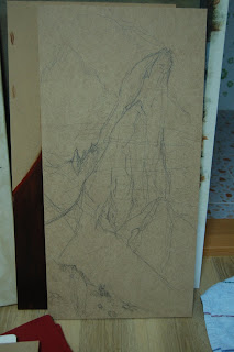
I liked it, but decided I have painted a lot of dicks in my day, and maybe I should tone down the phallic nature of the peak a bit. I came up with this drawing, on MDF:
It is only a start, and I will let you know when I finish the drawing/start on the painting. Here is a close-up of dem sheepies and their shepherd friend:
Labels:
Paintings,
Process/Sketches
Subscribe to:
Posts (Atom)


